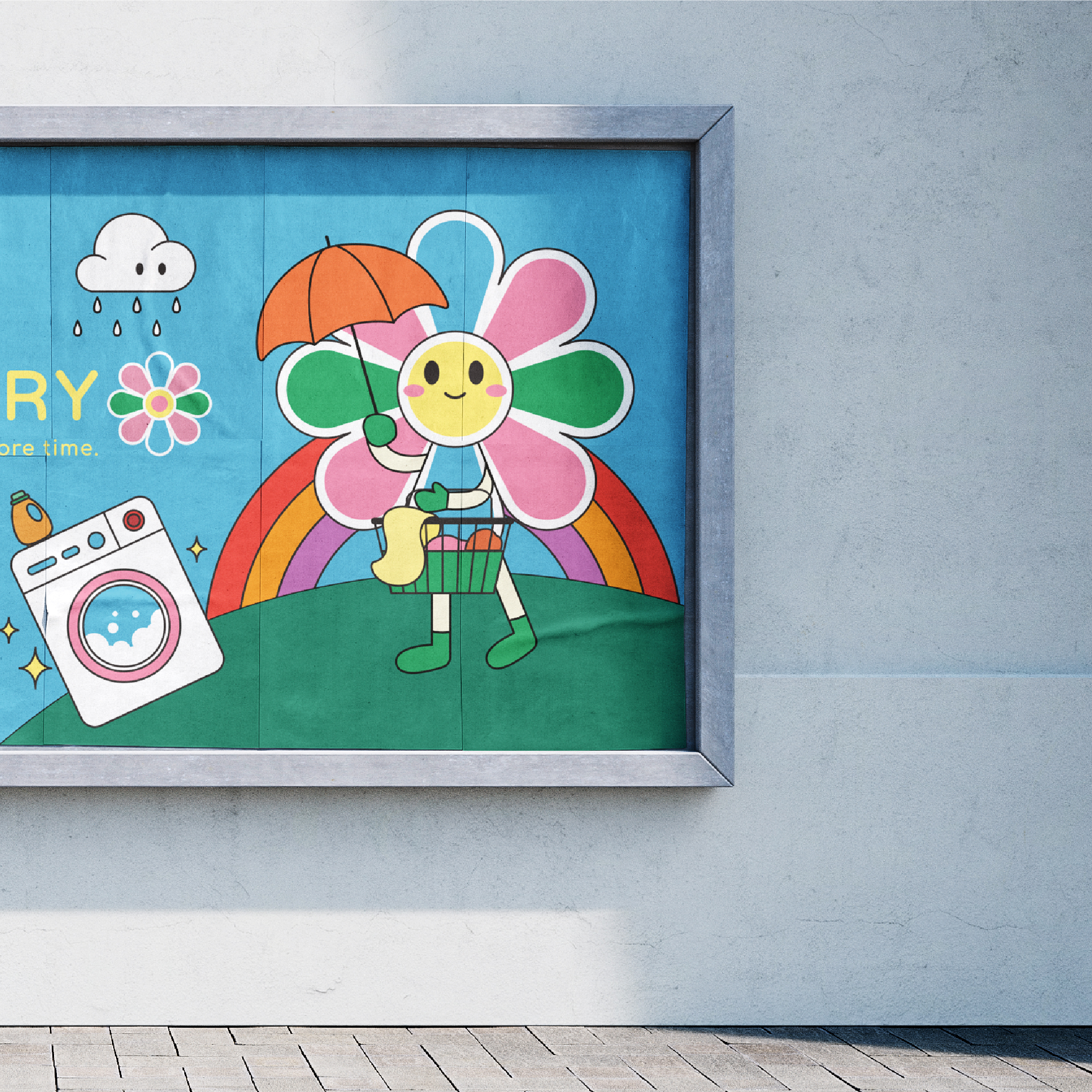
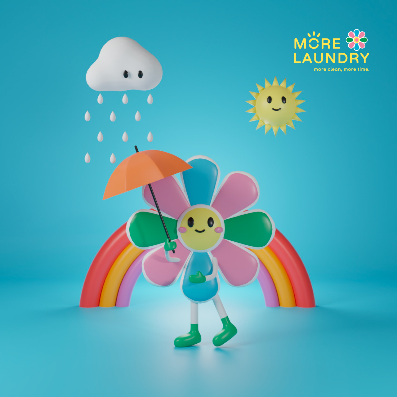
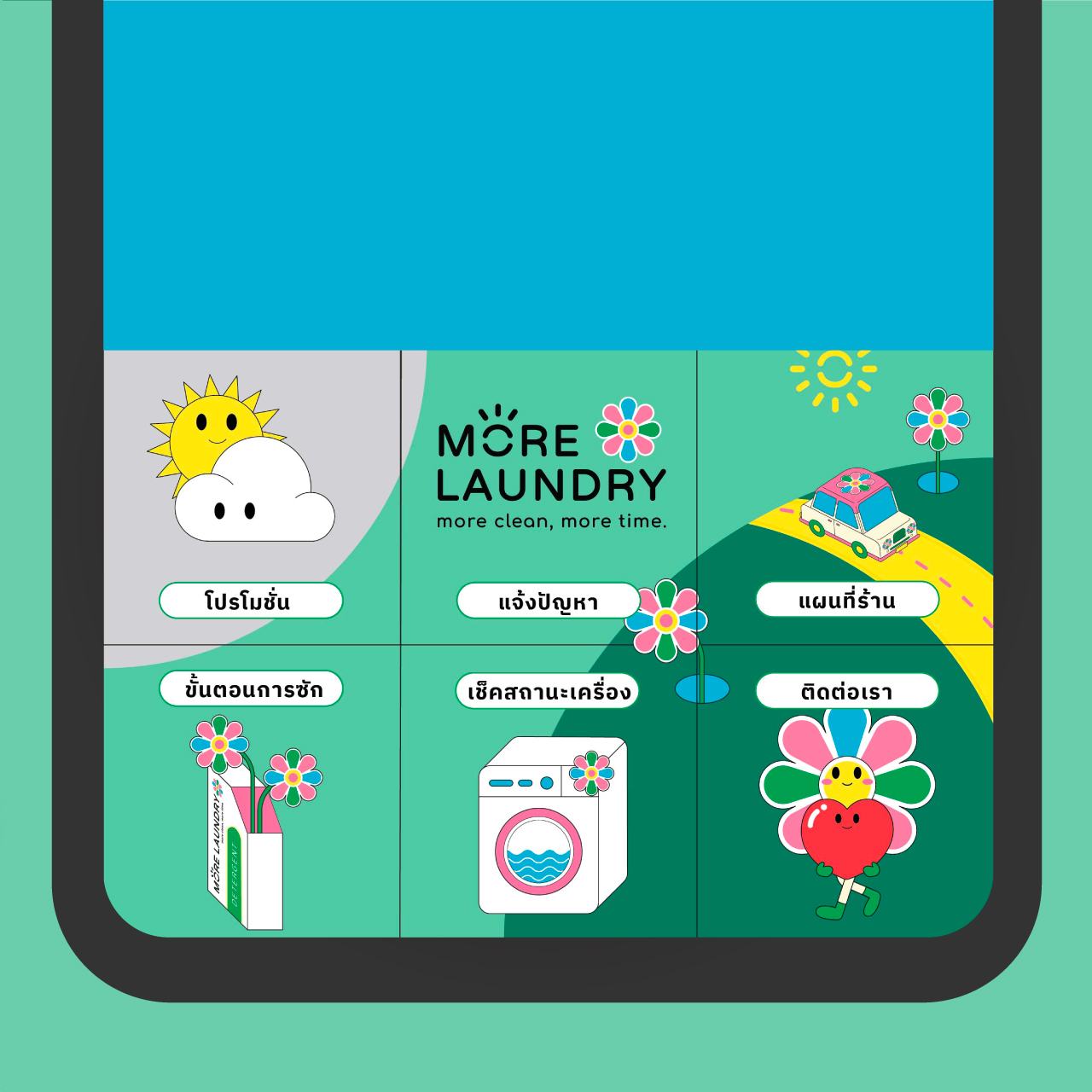
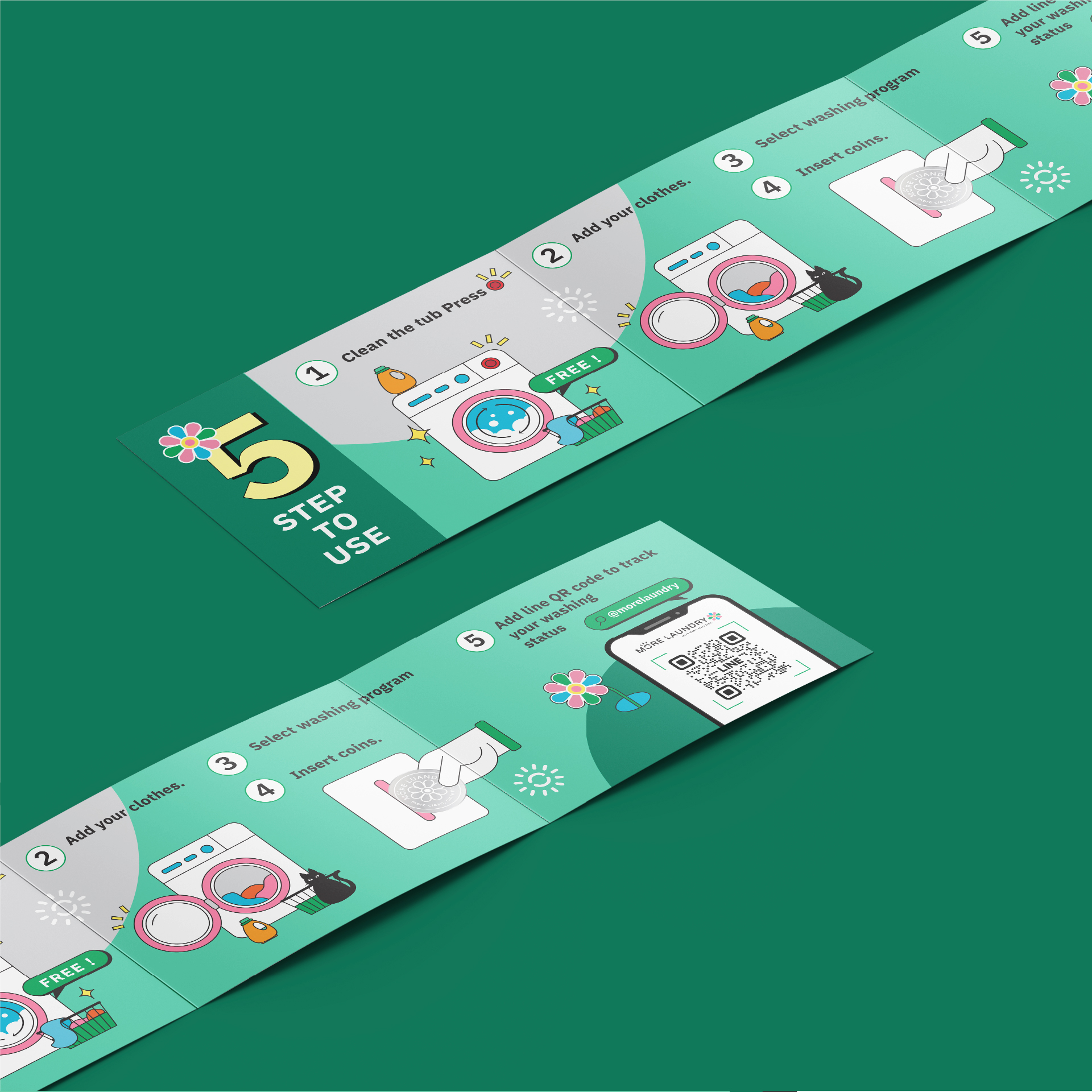
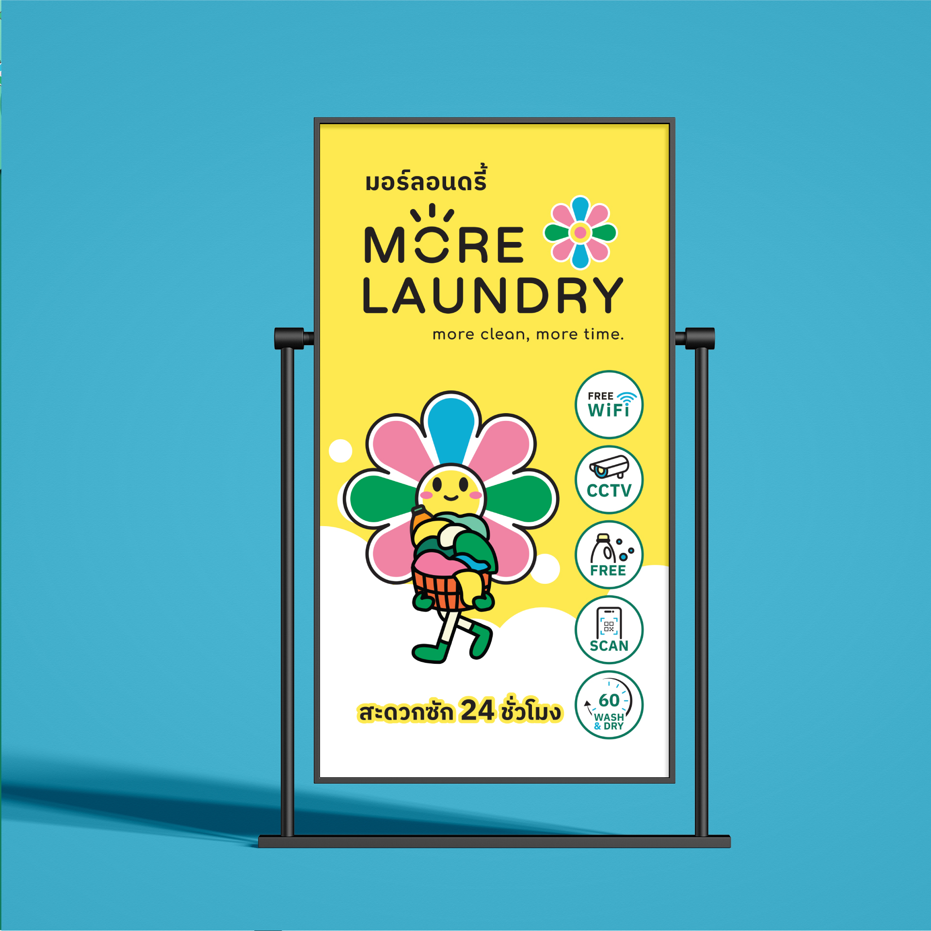
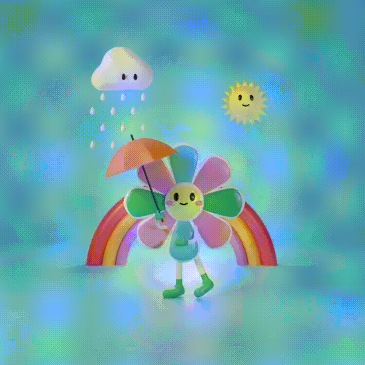
More Laundryisn’t just a laundry service; we’re your friendly companion through every laundry adventure. Meet Mory, our cheerful flower character, who’s always wearing a sunny smile. Mory is joined by her best friends, “Sun” and “Rain,” representing the warmth of drying and the cleansing power of washing. They’re here to make your laundry experience as friendly as a sunny day.
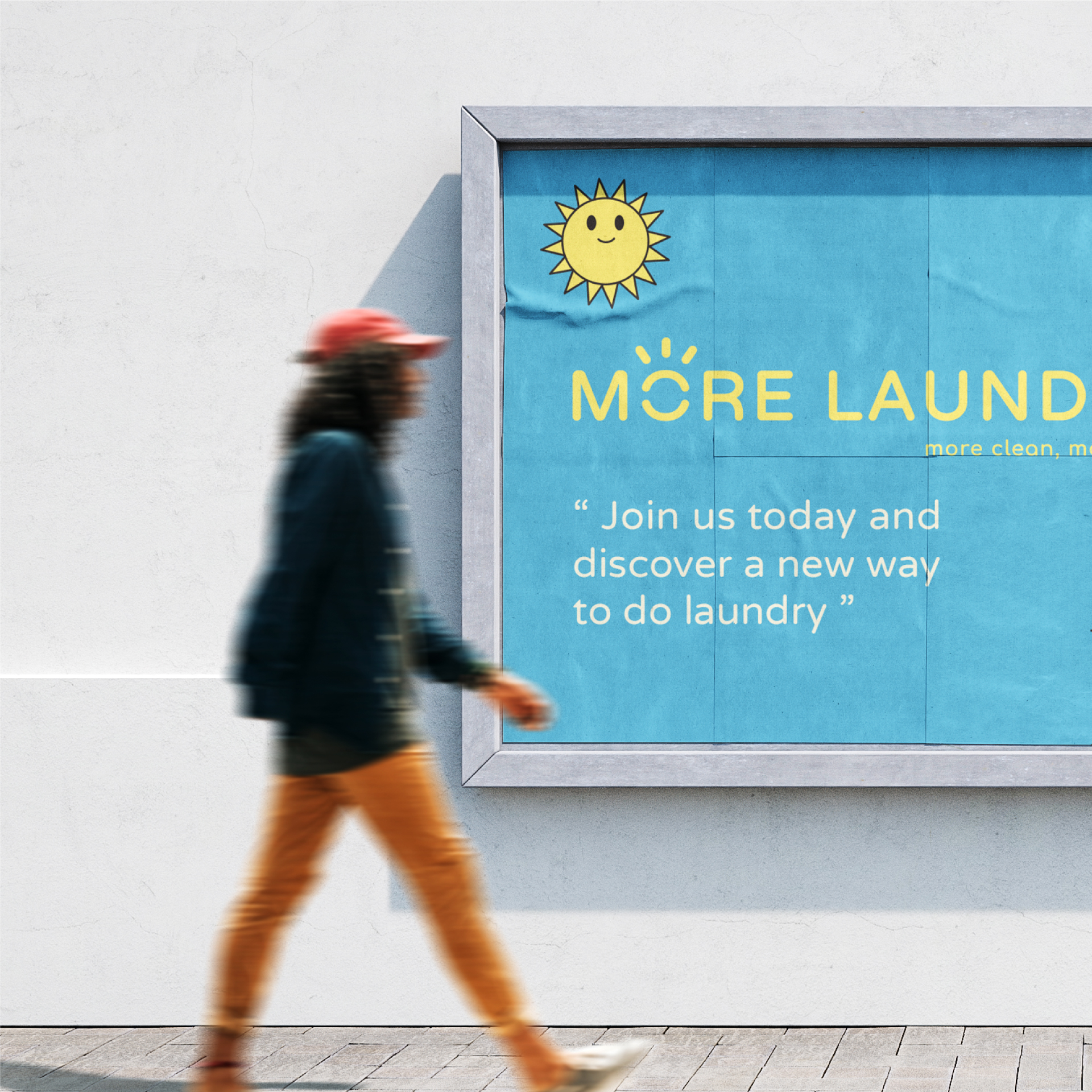
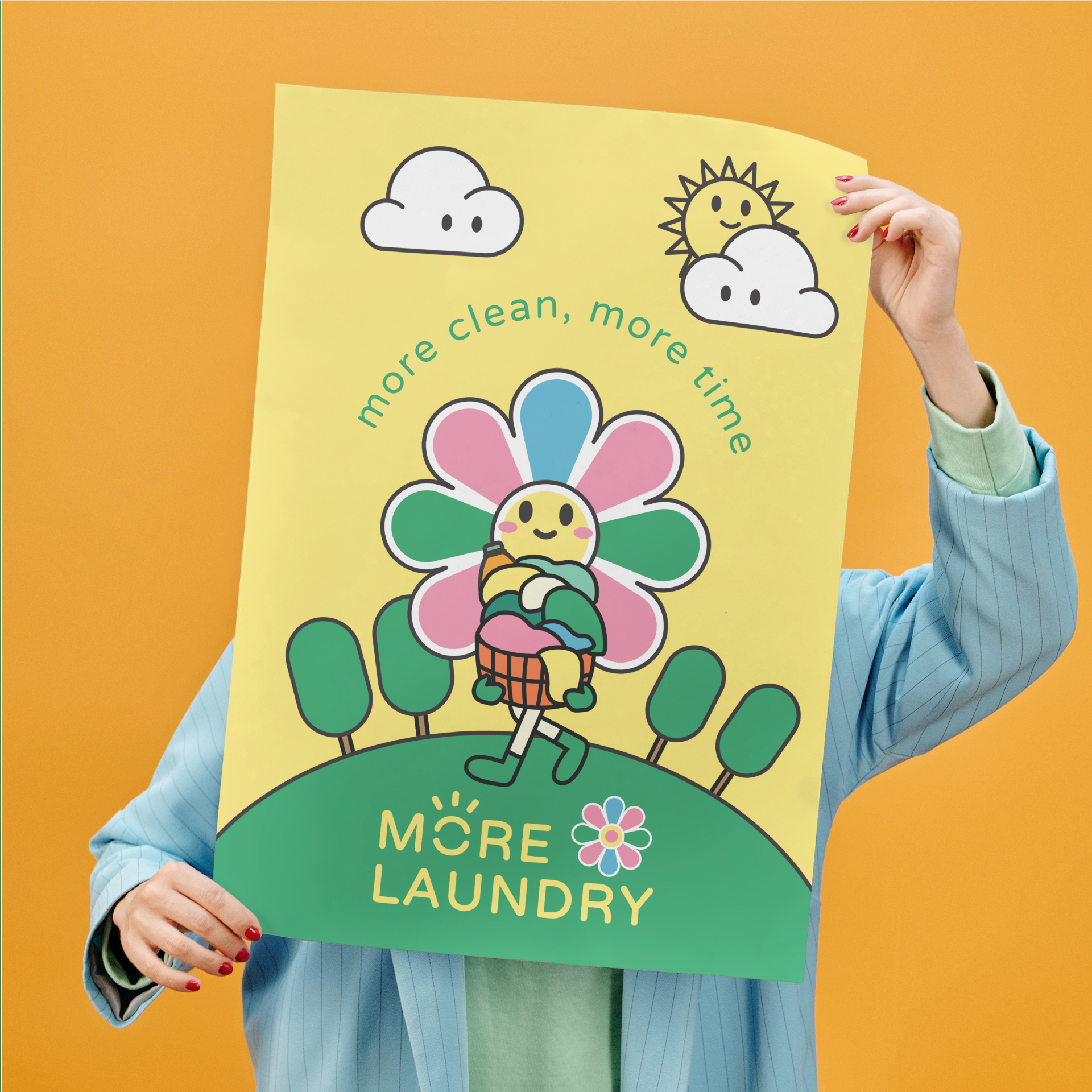
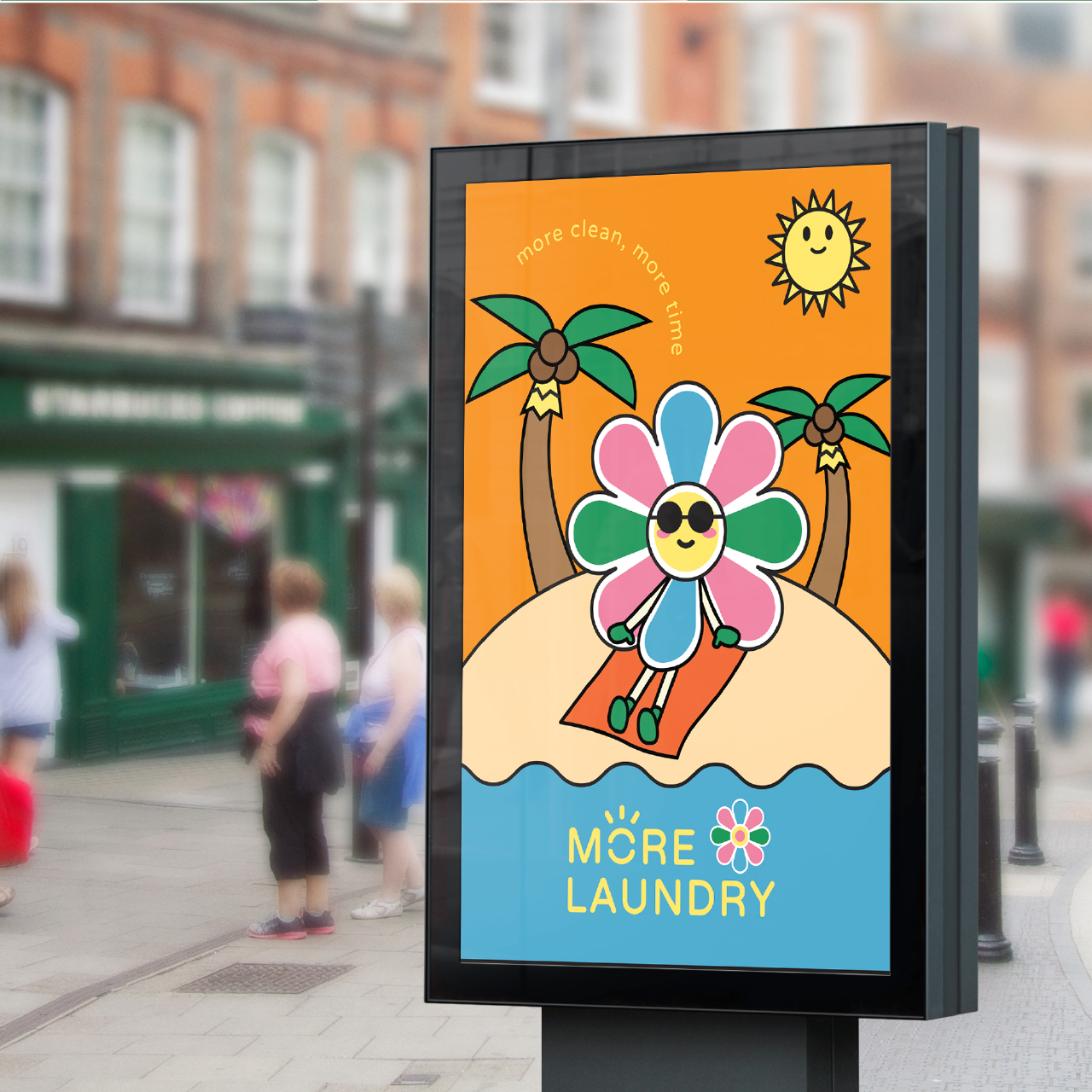
“More Clean, More Time,” effectively communicates the core benefits of your laundry service, emphasizing the efficiency and convenience it offers. It highlights that your service not only ensures cleaner clothes but also saves customers time.
Logo Description :
The More Laundry logo maintains a clean and easy-to-read font for the brand name, ensuring clarity and simplicity. The letter “o” in “More” is creatively designed as a radiant sun in a cheerful yellow, representing the brand’s positive and energizing approach to laundry care.
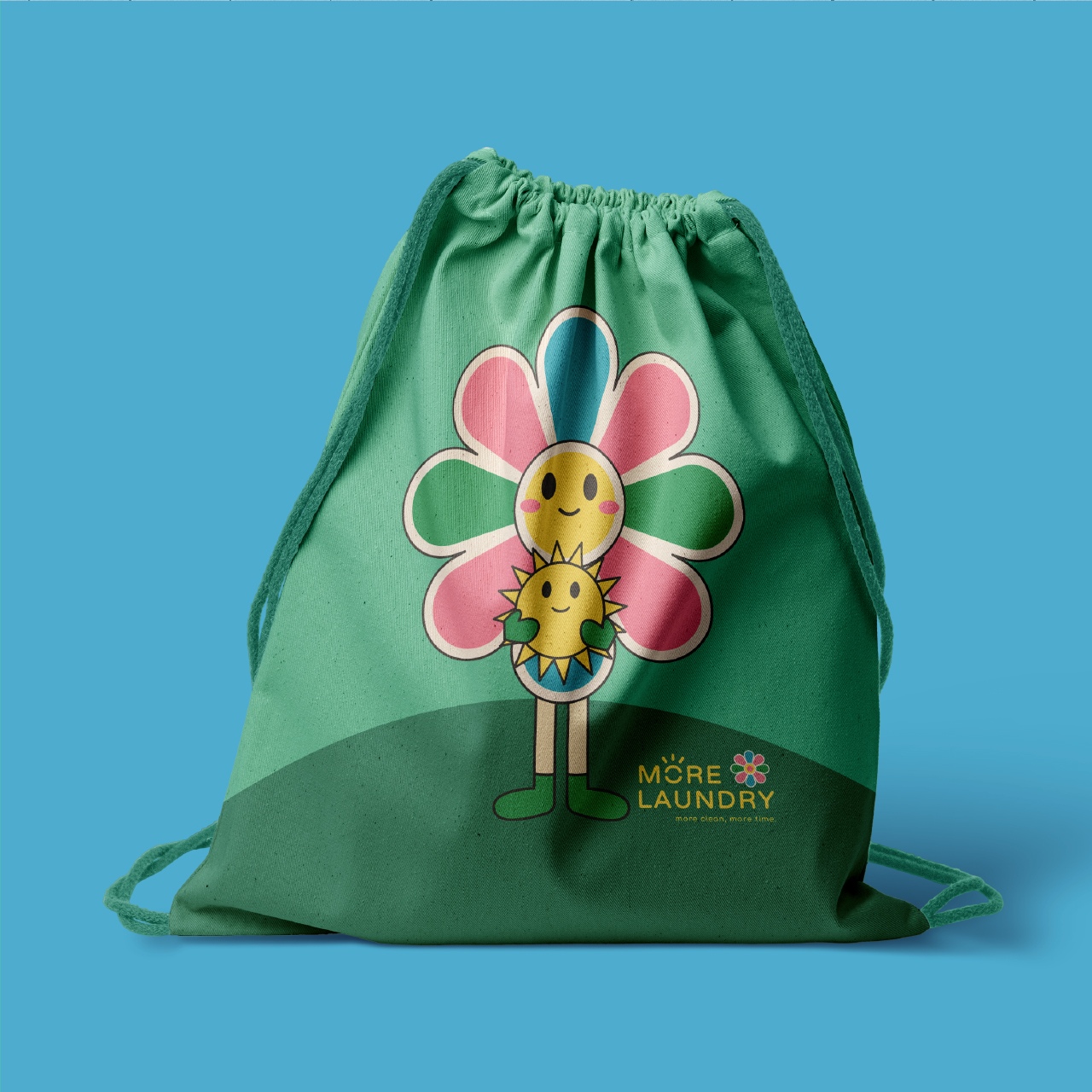
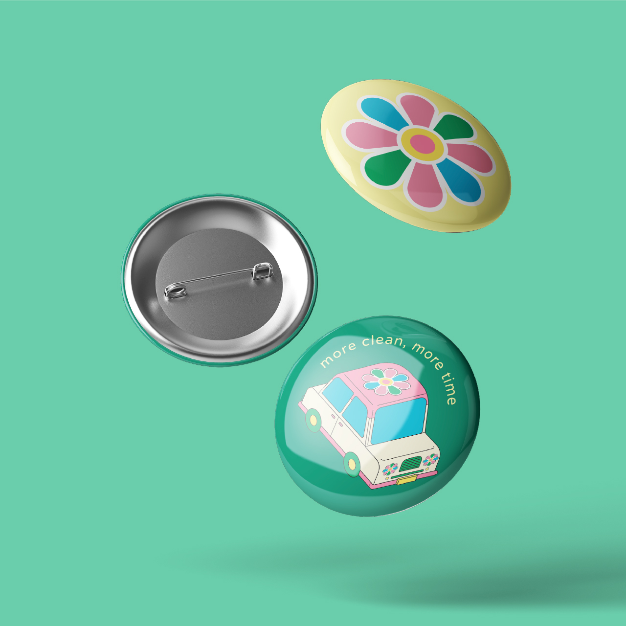
Adjacent to the brand name, there’s a symbol of a flower with eight petals arranged in a circular fashion. Each petal boasts one of four distinct and soft pastel colors: green, blue, pink, and a bright yellow center. These colors evoke a sense of freshness, friendliness, and joy, perfectly aligning with More Laundry’s mission.
Color Palette :
The sun (letter “o” in “More”) is bright yellow, symbolizing warmth and happiness.
The flower features soft pastel colors, with four distinct shades: green, blue, pink, and a sunny yellow center. These colors collectively create a harmonious and lively feel.
Character Description:
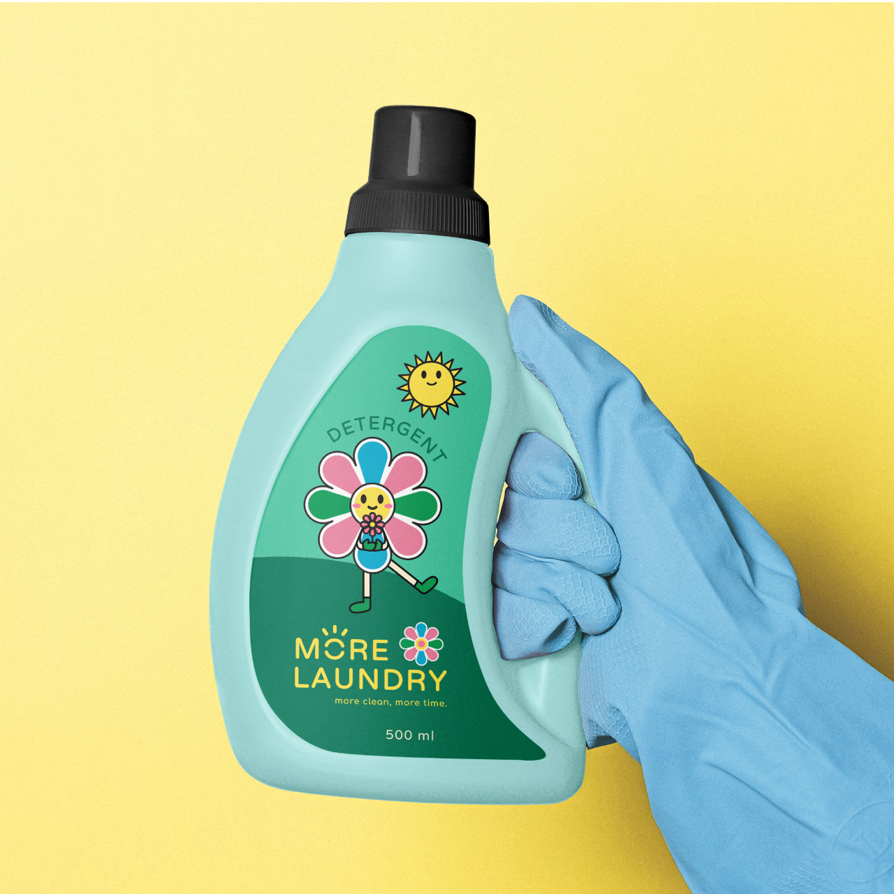
Mory is the embodiment of More Laundry’s fresh and friendly spirit. Mory is a lively and cheerful flower character with a perpetual smile. The name “Mory” is derived from “More” and symbolizes the brand’s commitment to making laundry care more joyful and effortless.
Appearance : Mory’s design is captivating and playful. The character features a vibrant, colorful bloom with a face in the center. What sets Mory apart is the unique feature of its petal-like arms that can spin like a fan, adding an element of motion and fun to the character’s appearance. The face is always adorned with a bright, sunny smile, representing the happiness that comes with clean and fresh laundry. Mory also has two legs, giving it a playful and active personality.
Friends :Mory’s best friends, “Sunny” and “Rainy,” join in the laundry adventure. “Sunny” represents the warmth and energy of the drying process, radiating positivity and joy. “Rainy” symbolizes the cleansing power of the washing process, bringing freshness and vitality. Together, Mory, Sunny, and Rainy create a joyful and friendly trio that embodies the core processes of More Laundry. They often accompany Mory in various fun activities, highlighting the brand’s dedication to making laundry time enjoyable.